
Colour Focus
Janeen Duffin
We have collated this season’s trending hues, whilst acknowledging the power of colour in your decor scheme.
From Zingy shades of yellow and fresh greens to bold blues, Prestigious’s team of in-house experts have collated this season’s on-trend colourways, with each one having differing but similarly striking effects.
Invite the warmth of Summer in with energetic shades, transforming a blank canvas into a home brimming with personality. With colour playing such an integral role in the look and feel of your interior, choosing the right palette based on your space, personality, and taste is essential. So, discover how to incorporate these trending hues into your home to crate the ultimate summer retreat.

Ray of Sunshine
Whatever form they are presented in, shades of yellow flood spaces with joy and energy.

A warm and bright hue, yellow is said to promote happiness more so than any other prime colour. Also the most noticeable of all hues to the human eye, this shade is ideal for creating an eye-catching décor scheme that invites happiness into your space.
Playful yellow fabrics make for perfect focal points, through accent chairs or statement curtains. Alternatively, utilise for scatter cushions and smaller furnishings such as throws to add vibrant touches to your space, without creating an overwhelming scheme. Maintain an elegant feel with complementary stripe and check designs, presented in nautical colourways. Additionally, pairing brighter yellows with darker hues such as Oslo’s Silver or Carbon creates a simultaneously inviting, elegant look.
Green Living
Create your own summer oasis nestled away from the heat with a serene green look. Inherently connected to nature, this colourway is perfect for inviting the outside in, as well as the positive energy of the outdoors.

Often used in interior design for its calming abilities, this colourway is especially beneficial for our wellbeing. Enrich your home with energetic shades of green accompanying scenes of lush greenery.
Sprawling frond and palm leaf designs provide the perfect leafy backdrop, with a range of hues, from softer greens to rich jewel tones, ideal for blurring the distinction between your outdoor and indoor spaces.
Anchor the botanical theme with a plentiful selection of house plants, opting for palm fronds to create the ultimate laid-back, tropical paradise. Natural furnishings such as textured jute rugs also ensure that nature remains as the centre piece of your space.
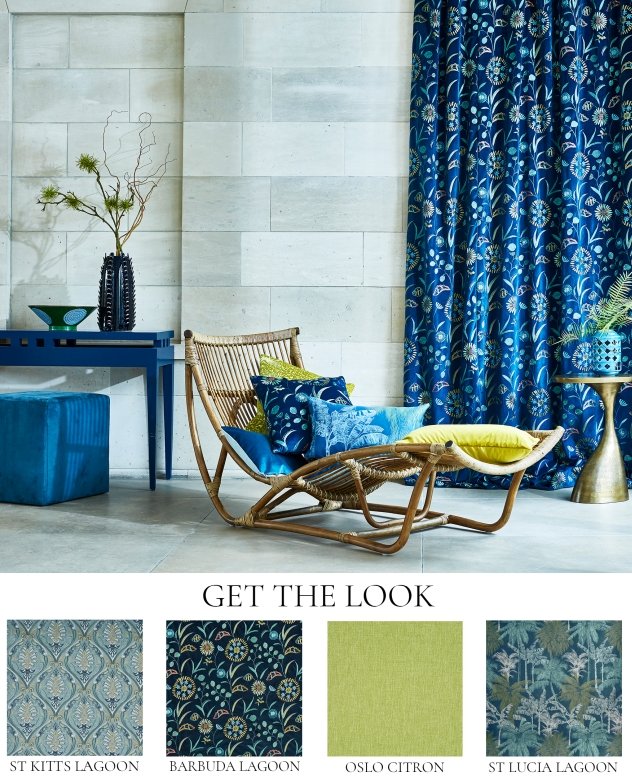
Out of the Blue
A cool and calm shade reminiscent of tropical skies and oceans, blue has a refreshingly tranquil effect on interiors.
This timeless hue works well in both contemporary and classic settings, suiting it to a range of living spaces.

Breathe energy into your living areas even on the greyest of days with this characterful shade, which responds especially well to sunlit rooms. With deeper hues signifying luxury and confidence whilst lighter shades evoke feelings of calmness and tranquillity, this versatile shade is perfect for creating a lively yet homely scheme.
Take cues from the tropics and invite this nature-inspired colourway in with dramatic sapphire shades, reminiscent of exotic isles. Pair with intricate embroideries for a decadent feel, or opt for lighter, saturated blues to create a softer scheme, with pattern-heavy designs adding depth and interest.
Mix and Match
Whilst colours have a range of unique characteristics, they often work in tandem to create wonderful compositions within interiors.
Your home should be a fun and welcoming place to be, enveloping you in a medley of colour and pattern. Forget prescriptive décor schemes and instead live with what brings you joy.

Blue and yellow are perfect for creating an inviting and summery space, with the warmer nature of yellow complementing the cooler tones of blue. Assortments of scatter cushions in complementary shades of these hues are perfect for adding vibrant touches to spaces, without creating an overwhelming scheme.
Alternatively, take inspiration from the sun-soaked shores of distant paradise with a combination of blue and green; richer sapphire shades and tangy greens work cohesively to emulate sprawling Caribbean landscapes.
Bring muted shades of green to life with pops of citrus yellow, whilst a mixture of playful and semi-plain designs in these upbeat shades are ideal for adding interest and depth to your décor scheme. Using white walls as a backdrop for colour ensures crisp simplicity, with accompanying darker hues creating a dramatic twist.