
Perfecting Pastels : A Guide to Pastel Interiors
Janeen Duffin
Sometimes the softest of shades can be just as impactful, as demonstrated by pastels.
Pastels bring so much joy to interiors, and it’s easy to see why. Quietly grabbing your attention, they add snippets of interest in a calming way.
Pastels are enjoying their moment in the spotlight. We love the idea of using these gentler tones as a way of experimenting with colour. Pastels are also a brilliant alternative to simpler neutrals. Their light undertones mean you instantly feel at peace, as soon as you step into the room. So, we’re here to help you nail your approach to pastels. Find below some of our favourite combinations, as well as tips on using pastels in interiors.

Pastel Greens and Rosy Pinks are a Match Made in Heaven
Pink and green should always be seen, especially when it comes to pastels.

We would suggest experimenting with small hints of pastels to start with. Introduce them in small doses such as through your accessories. Use cushions, trinket dishes, and artwork. Alternate two or three colourways to maintain interest. Pair pretty pink accessories such as candle holders with green cushions for example. Alternatively, use fabrics that feature both shades. At your window, delicate pinks look especially charming on striped sheer curtains.
Use Pastel Blues for Their Calming, Restorative Properties
Gentle and ethereal, delicate blues place us at ease.
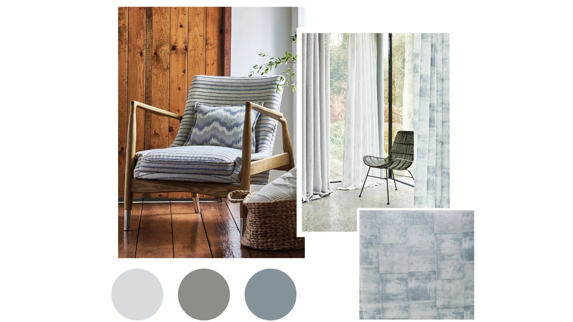
From sky tones to grey hues, blue is a popular pastel in interiors, and it’s easy to see why. Use blue for your curtain fabric and choose a gentle sheer for example. Pair with your scatter cushions and other soft furnishings. Create a sophisticated scheme by matching light blues with charcoal and creams.
Butter Yellow is as Dreamy as it is Energising
Like a ray of sunshine, Butter Yellow is a must-have for this season.

We’ve spotted Butter Yellow everywhere recently, from the runway to interiors. Yellow in general is perfect for brightening up spaces. Butter Yellow takes this one step further and creates a fun yet sophisticated feel. It adds character without overwhelming a space. Pair more saturated sunshine shades with earthier yellows and neutrals to create balance. Butter Yellow works particularly well in living rooms and bedrooms, thanks to its calming nature.
Pair Pastels with Darker Hues for a Refined Approach
Balance out the bright and airy nature of pastels with rich colourways.

Create a sophisticated feel and layer darker colours with your chosen shades for a balanced scheme. Pair a delicate petal pink with a more vibrant fuschia or berry tone, for example. Prevent your space from becoming too busy by using no more than 3 or 4 shades. Choose a rich, bold hue four your upholstery fabric and provide a restful space to unwind. Allow the summer sun to pour in with a light and airy curtain at your window.