
5 SMART DECOR IDEAS FOR CLASSIC BLUE
Guest User
One of the world’s biggest trend predictors and influencers is colour magnate Pantone. Each year it chooses a colour that will set the mood for the year ahead. The 2020 Pantone Colour of the Year is… wait for it (drumroll)... Classic Blue. Literally the ultramarine blue that used to come out of the paint pots you may remember from primary school art classes, although Pantone describes it as the blue of the sky after sunset. While some years their colour choice hasn’t quite taken off, Pantone is spot on this time. We’ve seen in our own social media postings how well people respond to stories that have a blue theme, and we’ve stayed ahead of the trend with recent collections which include a plethora of designs incorporating Classic Blue.

INTERPRETING THOUGHTS AND DESIRES IN COLOUR
The reasoning behind this colour choice is far deeper than mere whim. Pantone calls it dependable and stable, something we certainly need at this time when the world is so full of uncertainty and chaos. It leads the way to creating calming spaces for peace and tranquility.
Here’s how to pair Classic Blue and bring it into your decor with panache.
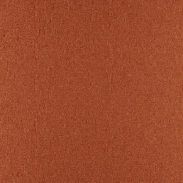
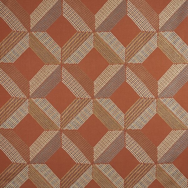
1. COMPLEMENTARY TERRACOTTA

Combine the earthy orange undertones of terracotta with Classic Blue. Complementary on the colour wheel, the warm, amber tones offset the cool blue without totally upsetting the equilibrium and this combo is guaranteed to get you some complimentary nods of approval from guests. You can also bring touches of terracotta to the scene with earthy pots and vases, all readily available in home and decor shops at the moment.


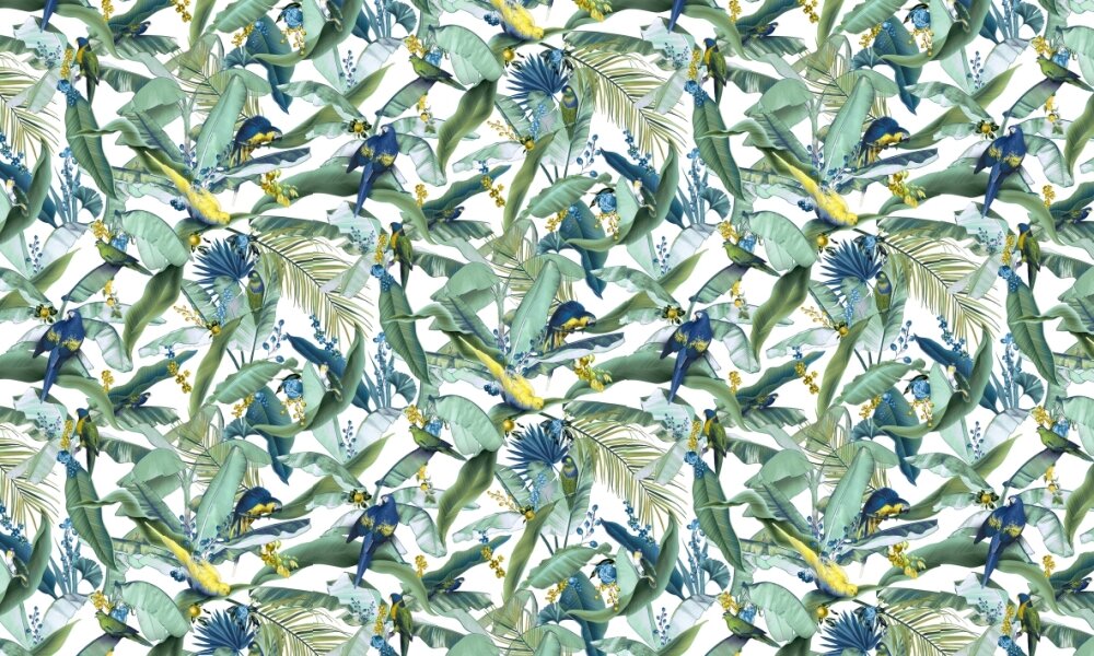
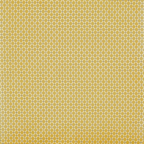
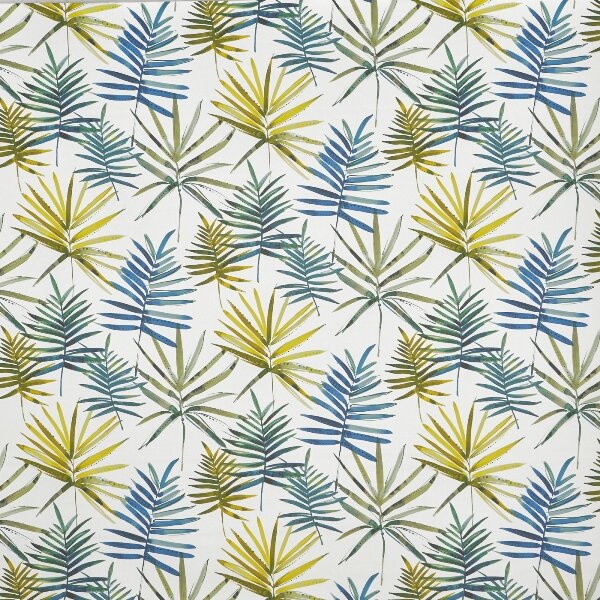
2. JUST ADD SUNSHINE

Lovers of acidic yellows and mustards will be pleased that these hues are here to stay. And they get a whole fresh look with Classic Blue. If tranquil and positive is the mood you’re after, this pair is well worth a look. Tresco, Plantation and Comfy are all dual-purpose fabrics, so you can go wild, tame, contemporary or cottagey with all these options, depending on the ratios you choose to combine them.
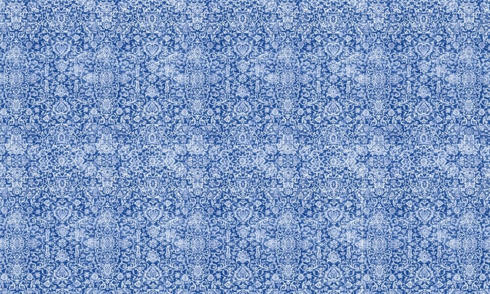


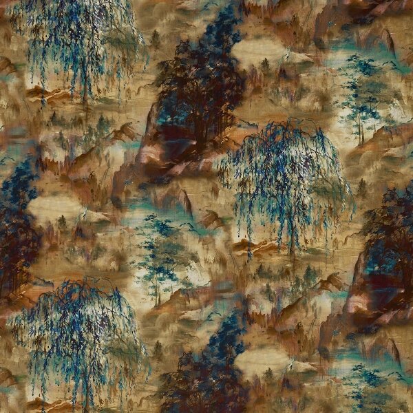
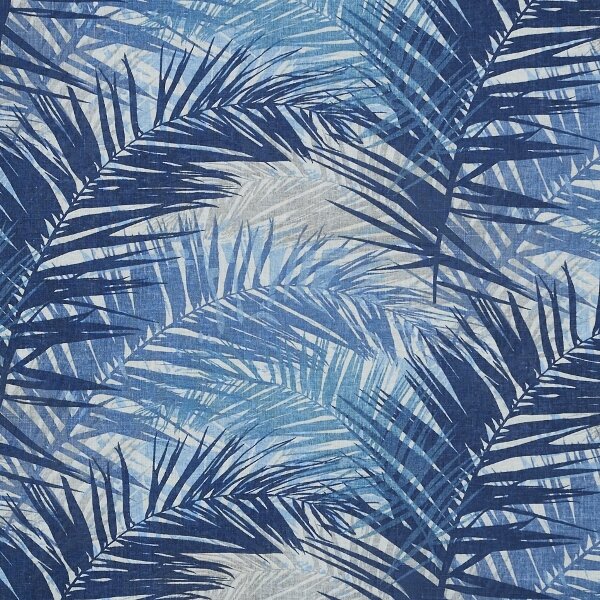
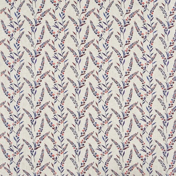
3. PROMISING NEW HORIZONS

You can totally lose yourself in these moody blue velvets from the aptly named Lost Horizon Collection. And see how well Pantone’s Classic Blue works with natural elements such as the embellished linens in the collection, raw brick and dark wood.
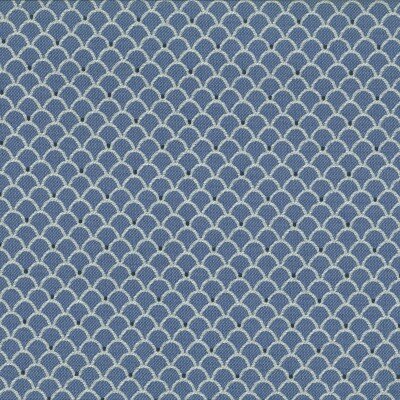
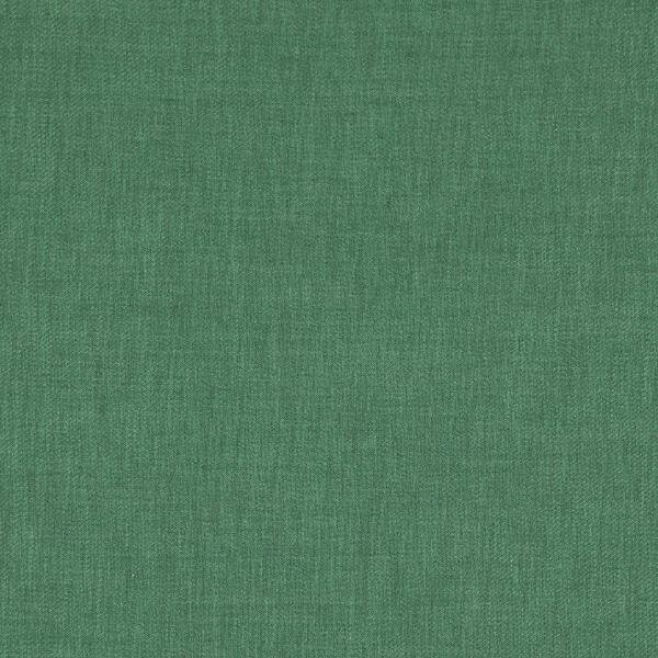
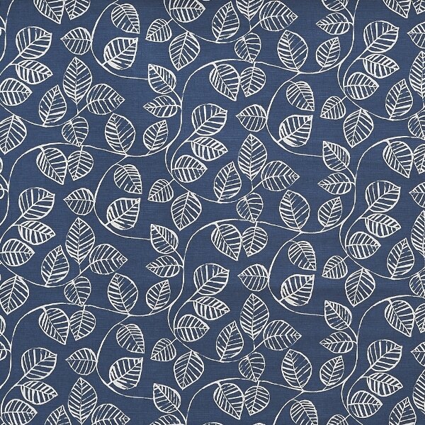
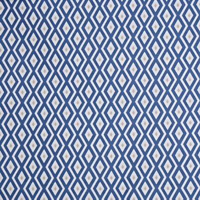
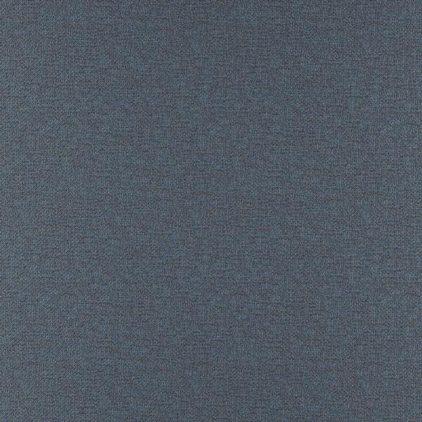
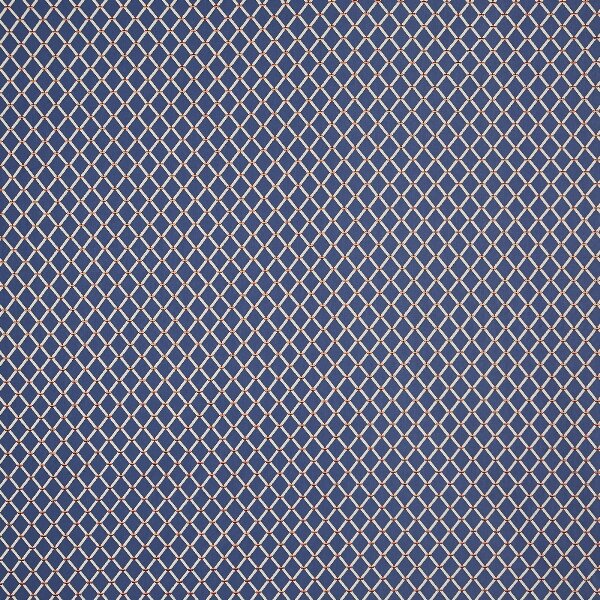
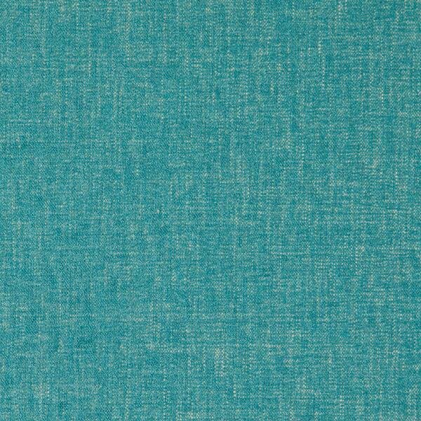
4. BLUE ON BLUE IS A WINNER

Go navy on Classic Blue for a cool and calming story, then ground the look with warm neutrals, which are timeless and elegant.


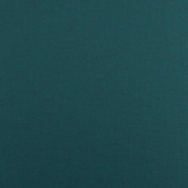
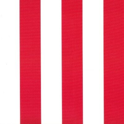
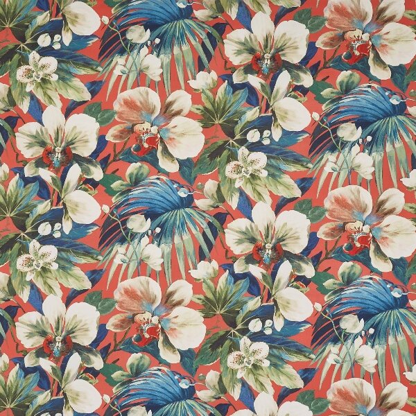
5. BLUE AND RED — ALWAYS A CLASSIC
Classic Blue has a sophisticated, enduring feel that will work for any space. Add a bolt of energy with red to bring in a youthful element, making it ideal for kitchens, bathrooms, play spaces and patios.


LIKE SOMETHING YOU'VE SEEN?
Visit one of our showrooms, get in touch or locate your nearest retailer of our products: